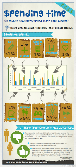
After looking through several generators, I chose to try Piktochart to create my infographic. I did have to create an account, but it only required a username and password. It was very easy to use and had enough themes and options to make it as personalized as you wanted within the theme.
This week I polled my classes (6th, 7th, & 8th graders) to see how they spent their time. They had options between art, excercise, reading, faith development, watching television, playing video games, doing chores, exercising or playing sports, spending time with family, homework & school activities, and spending time with friends. Although, I am not surprised by the numbers leading the way in television, video games and exercise/sports, I found it interesting that television watching was the only category in which every participant had 1 or more hours. I guess "everyone is doing it."
This was a fun project! I love being able to weave creativity and analysis together!
I can definitely see how creating an infographic could be used as a summative or assessment tool. In order to complete the graphic above, I had to decide a topic, survey, graph, interpret, calculate, organize, research, cite resources, and be creative, which shows so much more than a typical test. This sure does beat having to do a poster, because I can store, review, share, edit and reuse without the worries of storing and ruining a poster board.


I really like the layout of your infogram. It is a lot more interesting a format to share great information in a small space. It makes me think about the MAP skills, wouldn't it be interesting to have the students make infograms about different skills on the test. Maybe the visuals will help them during test time. Just a thought.
ReplyDeleteGood idea! It would be interesting to see what they come up with.
DeleteYour infograph is very visually appealing! Will you use this as an example to have your students create their own survey? Now that I know what I am doing I would like to try a different program to create other infographs. Was Piktochart user friendly? Would you have your students use this program or try something else?
ReplyDeleteyour infographic looks great! I love the colors and graphics you chose - very attention-grabbing and visually appealing! The topic is also relevant to the students and is something I feel the students would find interesting and enjoy! This would be a fun project for the students to complete on similar topics as part of a class assignment - I have a feeling they would get very involved in such a project! Great job!
ReplyDelete